
There's a drawing language hiding inside HTML, and you've been looking at it every day without really seeing it. The loading spinner on your dashboard. The icons in your navbar. The underline that stretches when you hover a link. The checkmark that draws itself after you submit a form. All of them are SVG, quietly doing the work.
And yet — if you've ever copy-pasted an SVG from Figma and stared at the markup wondering what half of it does, you're in good company. Most frontend developers have shipped plenty of SVG without ever writing one by hand.
Let's fix that. In about fifteen minutes, you'll have the mental model to read SVG, write it from scratch, and animate it with the CSS you already know.
<svg width="160" height="160" viewBox="0 0 160 160">
  <circle
    cx="80" cy="80" r="50" fill="tomato"
    class="shape s1" />
  <rect
    width="100" height="100"
    x="30" y="30" rx="12" fill="mediumpurple"
    class="shape s2" />
  <polygon
    points="80,20 140,140 20,140"
    fill="goldenrod"
    class="shape s3" />
</svg>
The whole thing condenses to a single sentence: SVG is DOM. Every <circle>, every <line>, every <path> is a real DOM element. querySelector finds it. CSS selectors style it. addEventListener hears its events. That one fact is the reason SVG is fun to work with once you've seen it.
Hello, SVG
What is SVG? It's an XML-based markup language for two-dimensional graphics. Unlike JPG or PNG — opaque binary blobs that would look like gibberish in a text editor — SVG is plain text. You can write it by hand, paste it into your HTML, and every shape shows up on the page.
Here's the smallest SVG that still feels like something:
A red circle, 100 pixels wide, positioned at the center of a 160×160 canvas. Six lines of markup, no libraries, no canvas context, no build step. Drop that into any HTML file right now and it works.
You could save that SVG to a file and load it with <img src="...">, and sometimes that's the right call. But pulling SVG into an <img> treats it like any other image format, which misses most of the fun.
Here's the pattern that sells inline SVG to most developers the first time they see it — hover the shape and watch CSS transition the radius and fill of a live DOM element:
<svg class="icon" width="160" height="160">
  <circle cx="80" cy="80" r="50" />
</svg>No JavaScript. No canvas redraw. Just CSS transitioning attributes on a DOM element that happens to be a circle instead of a div. That's the promise: illustrations with the full power of the web platform behind them.
Once you start looking, you'll see SVG everywhere — icon systems, charts, maps, logos, loaders, illustrations. It's the quiet foundation of modern UI graphics.
The shapes you'll actually use
How do you draw shapes in SVG? Use one of six geometric primitives — <line>, <rect>, <circle>, <ellipse>, <polygon>, and <path> — and set attributes that describe their geometry.
Where HTML gives you <p> and <h1> for documents, SVG gives you <circle> and <rect> for drawings. The first five primitives handle about 80% of UI graphics. <path> is the universal escape hatch — a subject worth an article of its own.
We'll spend the rest of this section with the first five.
Lines
The simplest shape in the language. Two points, one line between them. Move each endpoint with the sliders:
<svg width="240" height="160">
  <line
    x1="20" y1="140"
    x2="220" y2="20"
    stroke="#f39c12"
    stroke-width="3" />
</svg>
Four numbers — x1, y1, x2, y2 — and SVG handles the rest. Try drawing a diagonal line in pure HTML and you'll end up with a thin <div>, transform: rotate(), absolute positioning, and a calculator to work out the angle. SVG just asks "where does it start, where does it end?"
Rectangles
Rectangles position from the top-left corner with x and y, size themselves with width and height, and optionally round their corners with rx:
<svg width="260" height="180">
  <rect class="r" />
</svg>
Feels like a styled <div> until you run into two things that catch everyone the first time.
Circles
A center and a radius. Three numbers, one satisfying primitive:
<svg width="200" height="160">
  <circle class="c" />
</svg>
Hard to mess up a circle. cx/cy move the whole thing; r resizes it.
Ellipses
A circle with a second radius. rx controls horizontal extent, ry controls vertical:
<svg width="300" height="160">
  <ellipse class="e" />
</svg>
Notice fill-opacity. It's a dedicated attribute that makes the interior semitransparent without touching the stroke. In CSS you'd reach for rgba() on both background and border-color and still lack the same granularity. SVG's attribute surface is genuinely richer than what CSS exposes — every visual property can be tuned independently of every other.
Polygons
A list of points. SVG connects them in order and closes the shape automatically. Move each vertex with the sliders:
<svg width="240" height="200">
  <polygon points="120,10 230,190 10,190"
           fill="#e74c3c" fill-opacity="0.15"
           stroke="#e74c3c" stroke-width="2"
           stroke-linejoin="round" />
</svg>
Polygons don't have to be equilateral. Any set of points works — irregular, concave, star-shaped, self-intersecting. Badges, arrows, custom frames: all polygon territory.
For regular polygons — hexagons, octagons, stars — you need a pinch of trigonometry to space the vertices evenly around a circle. Slide sides from 3 to 12:
<svg width="300" height="200">
  <polygon
    points="150,40 201,70 201,130 150,160 99,130 99,70"
    fill="#1abc9c" fill-opacity="0.2"
    stroke="#1abc9c" stroke-width="2"
    stroke-linejoin="round" />
</svg>
That "pinch of trigonometry" is two functions: cos(angle) gives the x of a point on a circle, sin(angle) gives the y. Stepping angle from 0 to 2π in n equal slices places n vertices around the circle. But angle 0 in trigonometry points to the right, so without any offset the first vertex would sit on the circle's right edge. The -Math.PI / 2 you'll see in the code below shifts that start a quarter-turn to the top.
Making SVGs actually scalable
What is viewBox in SVG? It's a single attribute that defines an internal coordinate system, independent of the SVG element's rendered pixel size. It's the feature that makes SVGs truly responsive — and the reason PNG icons look fuzzy on retina displays while SVG icons stay crisp at any zoom level.
Every shape we've drawn so far used hardcoded pixel values. That's fine when the container never changes size, but it breaks the moment someone opens your page on a different screen. The fix is one attribute — pan and zoom a single rect by changing only its container's viewBox:
<svg viewBox="0 0 300 200" width="100%" height="200"
     style="background:#faf7ff; border:1px solid #e0d9f0;">
  <rect x="50" y="30" width="200" height="140"
        fill="#9b59b6" fill-opacity="0.2"
        stroke="#9b59b6" stroke-width="3" rx="8" />
</svg>
viewBox takes four numbers — origin-x origin-y width height. Here's the mental model that stuck with me: think of the <svg> element as a printed map, and viewBox as a sliding rectangle that frames a region of that map. The four numbers say "show this much of the world, from this corner, rendered at whatever pixel dimensions the element happens to have."
When viewBox dimensions match the element's pixel size, you get 1viewBox and everything appears at 2×. Double it and everything shrinks to half.
The first two values — the origin — pan the view. Set them to -50 -50 and you shift the visible region up and left by 50 units, revealing content that was previously off-screen. Useful for mini-maps, pan-and-zoom UIs, or any time you want to frame a region of a larger drawing.
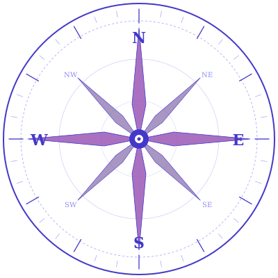
Here's the payoff. Same image on both sides, both shown at a heavy upscale — drag the divider:

viewBox vs viewport — two words, two things
SVG uses both terms, and they mean different things:
- The viewport is the outer rectangle — the rendered size, determined by
widthandheighton the<svg>element. - The viewBox is the region of content mapped into that viewport.
Viewport = outer pixel box. viewBox = inner coordinate box. Two words for two ideas. Thanks, SVG spec.
In practice, most developers set viewBox once at the top of the file and never touch it again. The payoff is huge: the SVG now scales like any other image, without quality loss, at any size, on any screen, forever.
Fill, stroke, and the rest
Every SVG shape has two paintable surfaces — the interior (fill) and the outline (stroke). Both can be set directly in markup or overridden in CSS. They're fully interchangeable:
.diagram rect {
  fill: #16213e;
  stroke: #e74c3c;
  stroke-width: 2;
}
CSS background and border will feel like the natural analogies — but SVG strokes expose a properties surface CSS borders can't match:
| Property | What it controls |
|---|---|
stroke | Color |
stroke-width | Thickness |
stroke-dasharray | Dash pattern — alternating dash and gap lengths |
stroke-linecap | End caps: butt, round, square |
stroke-linejoin | Corner joins: miter, round, bevel |
stroke-dashoffset | Slides the dash pattern along the outline |
stroke-opacity | Transparency of the stroke, independent of fill |
Seven properties of fine-grained control. CSS borders give you maybe two. Flip through each one:
stroke — colour of the outline. Any CSS colour value works.
<polygon ... stroke="#e74c3c" stroke-width="3" /><svg width="180" height="120">
<polygon
points="80,15 120,15 140,55 120,95 80,95 60,55"
fill="none" stroke="#e74c3c"
stroke-width="3" />
</svg>Mix every stroke property at once and see what each one does:
<svg width="220"
  height="140"
  viewBox="0 0 220 140">
  <polygon
    class="hex"
    points="80,15 120,15 140,55 120,95 80,95 60,55"
    fill="none" />
</svg>The stroke-dashoffset trilogy
How does stroke-dasharray work? It defines an alternating pattern of dash and gap lengths along a path's outline. Paired with stroke-dashoffset — which slides that pattern along the shape — it unlocks three of the most recognizable animations on the web.
stroke-dashoffsetis the single property that makes SVG animations click.
You've definitely seen all three. Here's how each one is built.
Marching ants
Small dashes cycling endlessly around a selection box — the effect you see in image editors when you lasso a region:
<svg width="180" height="140">
  <rect
    class="selection"
    x="30" y="20"
    width="120" height="100"
    fill="none" stroke="#f39c12"
    stroke-width="2" rx="2" />
</svg>The trick: set stroke-dashoffset to negative the total dash + gap length for a perfectly seamless loop. The pattern slides exactly one period and arrives at a position indistinguishable from where it started.
Loading spinner
The spinner every SaaS app ships. Two animations collaborate — one grows the visible dash, another rotates the offset around the circle:
<svg width="100" height="100">
  <circle
    class="spinner"
    cx="50" cy="50"
    r="40" fill="none" />
</svg>The dash itself breathes in and out, while its position rotates around the circle. Layered against a still circle, you get the classic indeterminate spinner.
Self-drawing path
The showstopper. Every landing page's hero animation. The checkmark that draws itself after your form submits. A logo revealing on page load.
Hide a full-length dash behind a matching offset, then animate the offset to zero — even for a complex single-stroke figure traced in one continuous contour:
<svg width="430" height="430" viewBox="0 0 3841 3841">
  <path
    class="stroke"
    pathLength="100"
    d="M 2.6 7384.9 … (quite a lot of points) … "
    fill="none"
    stroke-width="3"
    stroke-linejoin="round"
    stroke-linecap="round" />
</svg>
The whole silhouette — head, body, legs — is one continuous <path> that never lifts the pen, which is the prerequisite for the dashoffset trick to feel like a single drawn line. Add pathLength="100" and the browser scales the dash math against your declared unit instead of the real arc length, so you never have to chase the magic number with element.getTotalLength(). This pattern — the self-drawing SVG animation — appears on thousands of product sites. A handful of lines of CSS. No dependencies.
The rest of the iceberg
What we covered — the primitives, viewBox, fill, stroke, and the stroke-dasharray animations — gets you about 80% of real-world SVG work. The remaining 20% lives in features that each deserve their own primer:
<path>— the universal shape. Cubic Bezier curves, arcs, freeform outlines. Anything you can draw in Illustrator,<path>expresses as a compact string.<clipPath>and<mask>— cut shapes out of other shapes, or use grayscale images to control transparency pixel-by-pixel.<filter>— Gaussian blurs, drop shadows, color matrix transforms, displacement maps. A full compositing pipeline inside your markup.- Gradients —
<linearGradient>and<radialGradient>are first-class fill values. Define once, reuse anywhere. <use>and<symbol>— define a shape template once and stamp it out repeatedly. The SVG way to build an icon system without duplicating markup.<foreignObject>— embed arbitrary HTML inside an SVG, for when you need vector rendering and text selection and form inputs in a single canvas.
When to use inline SVG vs img tag
Use <img src="foo.svg"> when the graphic is purely decorative, never needs to be styled by your site's CSS, and is large enough that HTTP caching it separately is worthwhile.
Use inline SVG — markup pasted directly into your HTML — when you need to style it with CSS, target it with JavaScript, animate individual elements, or respond to user interaction. For most interactive UI work, inline SVG is the right call.
Remember the thesis: SVG is DOM. Every primitive you just learned is a real DOM node. document.querySelector finds them. CSS selectors match them. addEventListener listens to them. getBoundingClientRect measures them. It's one rendering system the whole way down.
Built with SVG in mind at Obox Systems
This article is part of the Obox Systems engineering blog — where we share what we learn shipping interactive UIs, data visualizations, and custom design systems for product teams.
If SVG-rich work is on your roadmap, let's talk — we're always up for a conversation about craft. More primers on web platform fundamentals, frontend architecture, and AI-augmented development coming soon.